It’s funny how the kitchens we admired a decade ago still look current today, while others feel dated instantly. The difference? Strategic color choices.
I’ve found that certain cabinet hues last through the years because they’re rooted in balance and restraint, not fleeting fads. But here’s what most homeowners miss: the right timeless color for your kitchen depends on factors beyond aesthetics. Let me show you why.
The 5 Timeless Cabinet Colors (And Why They Outlast Trends)
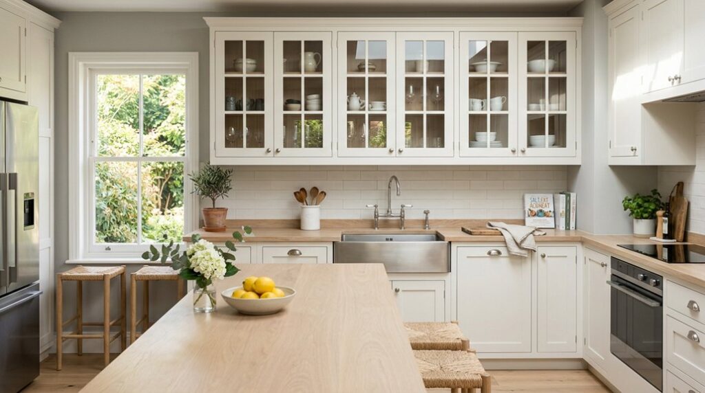
When you’re investing thousands of dollars into kitchen cabinets, you’ll want colors that’ll look just as beautiful in five years as they do today. I’ve found five cabinet colors that genuinely stand the test of time: White, Gray, Greige, Taupe, and Natural Wood tones.
White cabinets brighten spaces and reflect light beautifully. Off-white and creamy variants add warmth while maintaining that classic appeal. Gray offers sophistication across styles. Greige, that perfect gray-beige blend, balances cool and warm undertones seamlessly.
White cabinets brighten spaces and reflect light beautifully, while gray and greige offer sophisticated versatility for any kitchen style.
Taupe provides serene backdrops with excellent resale potential. Natural Wood tones shine through visible grain patterns, complementing everything from farmhouse to contemporary designs. These five colors work because they’re inherently versatile. They pair with virtually any countertop or backsplash.
You’re not chasing trends; you’re building timeless foundation pieces that’ll serve your kitchen beautifully for decades.
Natural Wood Cabinets or Paint: Which Finish Stays Timeless?
Now that we’ve covered the five timeless cabinet colors, here’s the real question: should you reveal the wood underneath or paint over it?
I’d argue that natural wood cabinets win for longevity. Quarter-sawn oak and stained cherry showcase beautiful grain patterns that actually improve with age, creating depth paint simply can’t match. These warm wood tones, think blonde to medium brown stains, soften modern lines while anchoring traditional spaces.
The key is choosing timeless finishes. Avoid heavy red, orange, or grey undertones that date quickly. Instead, opt for neutral stains that let wood grain shine.
Natural wood cabinetry enhances market desirability because it’s versatile. It bridges traditional and contemporary styles effortlessly. Paint requires refreshing every decade. Quality wood becomes more character-filled over time, making it the smart investment for staying current without constant updates.
Match Cabinet Colors to Your Kitchen’s Architectural Style

Your kitchen’s architectural bones should guide your cabinet color choice. If you’re working with traditional elements like crown molding, arched doorways, or classic hardware, I’d reach for creamy whites or warm wood tones that honor those timeless details.
Conversely, modern kitchens with clean lines and minimalist aesthetics work well with crisp whites, soft grays, or bold navy cabinets that emphasize sleek design rather than fight against it.
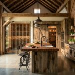
Traditional Kitchens: Warm Wood Tones
How do you anchor a traditional kitchen with authenticity and warmth? I’d choose warm wood tones for your cabinetry colors; they’re the foundation of timeless finishes that belong in classic spaces. Quarter-sawn oak, cherry, and walnut showcase natural grain beautifully, creating an inviting atmosphere that lasts decades.
You’ll want blonde or medium brown woods with simple grain patterns. They read as sophisticated without heavy red or orange undertones that date quickly. Cherry cabinets in shaker style offer enduring appeal, evolving gracefully as you update hardware.
These warm wood tones soften any space, complementing your countertops and backsplash while enhancing durability. They’re not trendy; they’re truly timeless, grounding your kitchen with the authenticity you’re seeking.
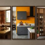
Modern Kitchens: Neutral and Bold
While warm wood tones anchor traditional spaces beautifully, modern kitchens thrive on a different philosophy: neutral bases paired with strategic bold choices. White cabinets brighten your space and reflect light, creating an airy feel that works across architectural styles. If pure white feels too stark, soft gray or greige, that perfect gray-beige blend, adds sophistication while keeping things contemporary. These timeless colors become your versatile backdrop.
Now here’s where personality enters. Navy blue makes a bold statement, adding drama without overwhelming your kitchen. Deep blues adapt beautifully to various hardware finishes and materials.
Pair your neutral cabinets with metallic accents and natural elements for a balanced, modern aesthetic that feels both polished and welcoming. You’re creating a space that honors contemporary design while staying relevant for years ahead.
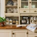
Cabinet and Countertop Pairings That Age Well

I’ve found that creamy white or greige cabinets paired with marble-look quartz or natural stone countertops create a foundation that stays relevant for decades. Your lighting choices matter tremendously; soft, warm-toned fixtures enhance the richness of wood cabinetry with quartz, while brighter, neutral lighting prevents greige from appearing washed out or trendy.
Timeless Color And Material Combinations
What makes a kitchen cabinet color feel fresh in year five and elegant in year fifteen? I’ve found that the answer lies in pairing the right cabinet colors with complementary countertops.
Natural wood cabinets, think quarter-sawn oak in warm tones, create lasting warmth that works beautifully with most countertop styles. White cabinetry, especially classics like Chantilly Lace, reflects light and maintains broad appeal across decades. Timeless neutrals such as greige and taupe balance cool and warm undertones, adapting seamlessly to evolving design trends.
Blue and navy accents, when paired with metallic hardware, deliver dramatic focal points that feel high-end without dating your space. I recommend choosing finishes with subtle grain detail rather than trendy high-gloss looks for enduring sophistication.
Lighting Effects On Paired Surfaces
How you light your kitchen fundamentally changes whether your cabinet-and-countertop pairing looks unified or mismatched. I’ve learned that warm incandescent, cool LED, and natural light each shift how we perceive color. That gorgeous white oak cabinet you loved under showroom lighting might feel cold under harsh kitchen LEDs.
Test your selections with poster boards at different times. Morning natural light reveals how lighter finishes reflect brightness and openness. Afternoon sun exposes undertones in satin or semi-gloss finishes.
Your countertop’s texture matters too. Granite’s reflective surface bounces light differently than matte quartz. This interaction creates perception shifts. Designer Benjamin Moore recommends viewing samples throughout your day; breakfast, dinner, and evening hours included. This thorough testing prevents costly mismatches that’ll affect you for years.
Keep Cabinet Colors Fresh With Hardware Updates

Sometimes the simplest revitalization yields the biggest impact, and that’s exactly what hardware updates deliver. You don’t need a full kitchen renovation to refresh your kitchen. By swapping handles and pulls on timeless cabinets, I’ve discovered you can update the look of your cabinet colors and overall style without touching paint or wood.
Here’s what makes this strategy brilliant:
- Shift perceived aesthetics: Brushed nickel reads modern; brass feels warm; matte black adds sophistication
- Maintain flexibility: Neutral cabinet colors paired with versatile hardware lets you evolve with trends
- Maximize value: This cost-effective approach aligns with forever-home goals while minimizing interruption
Pairing shaker-style cabinets with updated hardware supports long-term adaptability. Your neutral base remains constant while hardware becomes your primary design lever, refreshing perceived value and keeping your kitchen perpetually current.
How Lighting Affects Which Timeless Color Works for You

While hardware refreshes your kitchen’s aesthetic, lighting fundamentally shapes how your cabinet colors actually look, and I mean this literally. Warm incandescent bulbs shift timeless whites toward cream, while cool LED or natural light reveals their true undertones. I’ve seen homeowners shocked when their carefully chosen gray cabinets appeared blue under certain conditions.
Here’s what I’d do: observe tester pots under your kitchen’s actual lighting at different times. Natural light broadens what works, making lighter hues look authentic. In dimmer spaces, reflective finishes prevent heaviness.
Pay attention to undertones that complement your countertops and backsplashes. This harmony keeps your timeless colors consistent throughout the day. Your lighting isn’t just functional; it’s your cabinet’s best friend or worst enemy.
Common Color Mistakes That Age Cabinets

Why do so many beautiful kitchens suddenly feel dated? I’ve found that choosing trendy colors over timeless ones is the primary culprit. Here’s what I’d avoid:
Beautiful kitchens age poorly when trending colors overtake timeless design choices—prioritize longevity over fleeting fashion.
- Overly saturated whites that lack depth, pure white can feel harsh and clinical without warmth
- Trendy grays with strong blue undertones that clash with evolving design preferences
- Mismatched neutral bases where greige or taupe undertones conflict with your countertops
Instead, I’d reach for creamy whites like White Dove, which blend brightness with subtle warmth. Gray works beautifully when you choose sophisticated, balanced tones.
Neutral bases with balanced cool and warm undertones, think taupe or greige, age gracefully across decades. The key? Select colors that feel timeless rather than momentarily fashionable. Your cabinets deserve longevity, not regret.